What is typography?
How to make the text readable? What font pairs to choose? What typeface to choose for the business or website, so you can’t go wrong? Typography can provide answers to these and other important questions. One of the sources of information is text. In order to attract the reader’s attention and to make it stand out from the rest, it has to be beautifully designed and easy to read. A field that contains rules about the layout of text, the choice of scripts and sizes is called typography.
Typography, at its core, is typesetting text. It is placed on paper or screen, set indentation and spacing, and selected fonts. Well-designed material looks laconic and pleasant. It is easy to read, and has a sense of harmony. The rules of typography take into account the parameters of the script, the size of the text, and its placement. To design text well, you need to know what fonts to use on the project, what the lettering is, what are the proportions between the main text and the title.
Is it a font or a typeface?
Let’s start by clearing up some misunderstandings. Is it a font or a typeface — this is a very frequent question. These terms are interchangeable, so it makes some people confused.
A typeface is a set of fonts, but a script may refer specifically to a particular style or weight in a font family. To make it clearer and more detailed, let’s look at a concrete example that will put things in perspective. Times New Roman is a typeface. Times New Roman Bold is a special typeface in the Times New Roman font family. This is the difference between the terms. And here is the similar illustration:

Typeface categories
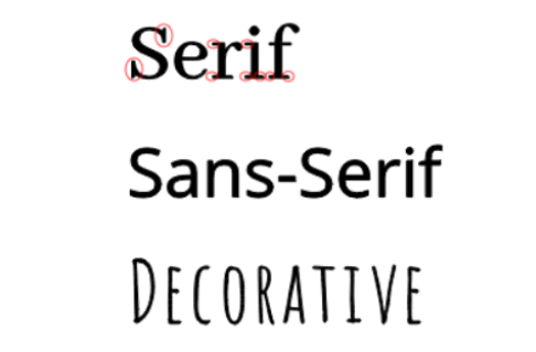
In order to choose the appropriate scripts, it is necessary to understand the categories in detail. Each has its own characteristics and recommendations for use in certain projects. In this guide, we will refer to three different type categories when selecting font pairs.
Serif typefaces

The serifs are small lines or strokes on the ends of letters that seem to be attached to the end of a larger stroke. But, not all serifs are identical. They have different variations depending on the typeface. Serif fonts are quite authoritative, and professionally demonstrate the importance of the text. One of the main advantages of this script is that it is diverse and has quite a few variations of lettering within the same family. Yes, it really does! Just one family of serifs can be plain, italic, bold, semi-bold italic, bold italic, small capitals and others. Impressive, isn’t it? Serif fonts are the more traditional type. They are often used in newspapers, books and magazines.
Sans Serif typefaces

Sans-serif fonts are scripts without serifs, that is, without those little hooks on the letters. They are more modern and therefore quite commonly used nowadays. They are perfect for different purposes, These may be web pages, headlines, banners, ads, prints, etc. All thanks to their easy readability. Sans Serif fonts are also effective in situations where there is a little space for the text. For example, these are names on maps, signboards, and text in applications.
Decorative typefaces

This category is used less frequently than the previous two, but is also quite popular. It is applied most often for headlines and titles, or for small amounts of large text, such as on greeting cards or posters. It is a great way to add personality to a design, but should be reserved for long paragraphs of the main text, as it can be hard to read.
Guidelines for selecting fonts
After we have discussed what typography is and figured out the three categories of scripts, let’s talk about how to choose the best typeface after all. This is not an easy task, especially when there are a really large number of best font bundles, it becomes difficult to choose the right one – Master Bundles.
Begin with inspiration
One of the most important parts of the job is motivation and, of course, inspiration. Find something that really inspires you. Whether it is browsing the social networks of top-class designers, professional books or something else. There you can find a lot of ideas and tips for your work, and perhaps pick up some original fonts for yourself. Also, pay attention to how the font affects the mood of the design.
Find a basic typeface for you
Regardless of what you are going to design, you must have some kind of basic font. If you decide to write a book, it is likely to take up most of the text. Alternatively, if it applies for web design, the script will be used in headings and the like. You should emphasize it, make it stand out and let it influence the structure of your design. The font should be the lead. And based on the choice of the main font, pick up the other additional.
Second font for contrast
Now that you have decided on the basic font for your projects, it is possible to select a second script. The main requirement is that it must be significantly different from the first typeface. Thus, it can create a kind of contrast, but at the same time complement the design. Why do you need two identical letterings, which will be difficult to distinguish from each other? It would look like a design mistake.
Width
One useful trick when choosing fonts is the opposition. Have you ever thought that different widths of scripts can harmonize? There is a kind of dissonance, but no. It is a pretty good idea, especially when it comes to headings. Try combining a condensed Sans serif font with a wider serif typeface. This is a great technique that is often applied by professional designers.
Don’t overdo it
Don’t overdo it or you will run the risk. Of course, this can vary depending on what you are developing, but you can easily get carried away and cause confusion. It is worth sticking to the general rule that it is perfect to take 2-3 different fonts for the design. Of course, there are times when you can take more, but for most projects it is worth following this rule.
The aim of your work
You need to fully understand what you are working in and what the purpose of it is. Figuring out what your design intent is will determine your choice of typeface. This small and simple rule defines all of your work.
Conclusion
And so we have already fully understood what typography is, found out the top three categories of fonts and got to grips with the nuances. So, now you know what techniques to use when choosing a typeface, and what you should take into account down to the last detail. Now it all depends on your creativity.