The average conversion rate for eCommerce stores globally is about 2,58%, according to Statista. Nevertheless, a quarter of them can boast having a CR from 5,31% or up. Finally, one out of ten online shops has a tremendous 11,45% rate and even higher!
Such outcomes depend not only on the products you sell but also on numerous other factors like the website’s performance, design elements, quality of content, and so on. Here we’ll discuss 10 exemplary product pages and their must-have elements that make people want to go through the sales funnel.
Three Main Directions to Follow
Note that most of the online stores mentioned below use a rich blend of features that are aimed at three main directions:
- To show off products as advantageously as possible.
- To make it easy for prospects to understand the product by collecting and providing all possible information.
- To retain leads and persuade them that buying is the best decision now.
Though almost all these product pages consist of more or less similar elements, some are better in visuals while others are more convincing when it comes to personalization.
Note that the speed of the pages, their usability, and adaptive design matter as well. If your online shop has all possible sections but performs slowly, people are highly likely to close the site and never return.
Thus, consider some improvements beforehand. The type of website called a PWA, or progressive web app, has been gaining popularity during the last couple of years. Take a look at some of the best examples of progressive web apps and put particular attention to the speed, UX/UI, and overall native app-like experience of these apps. All of that can be reached through any mobile or desktop browser without installing a weighty application!
Now let’s explore some superb product pages!
1. Impeccable Visual Content – Adidas
Adidas gives us a perfect picture of how a cool product page should look like. Everything is thought through, handy, and intuitive. In terms of visuals, the page gives all the user needs to make a conscious decision.
Firstly, the page provides high-quality zoomable photos from all angles. Secondly, the gallery contains a video where a model showcases the pair of shoes again from all possible sides. By the way, the demonstration in motion has been getting more and more common on product pages.

Screenshot taken on the official Adidas website
On the screen below, you can see that the typical product page of the Adidas website also has reviews, a cross-selling block “Complete the Look”, and basic info about an item. By the way, don’t underestimate product descriptions that we’ll go over in the next block!

Screenshot taken on the official Adidas website
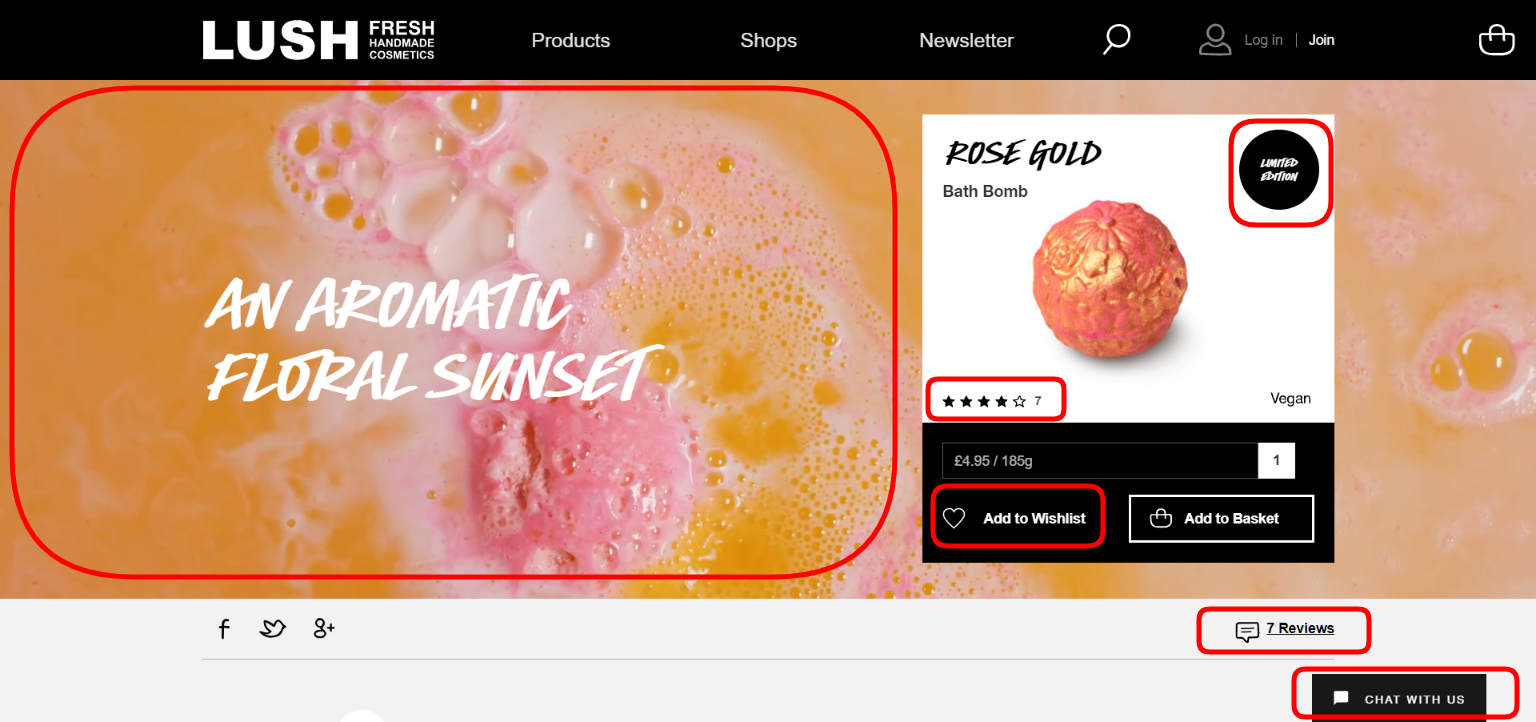
2. Exhaustive Product Descriptions – Lush
Next up is Lush with its gorgeous product pages. Take a look at the screenshot below, where the brand gives a terrific amount of important data conveniently and stylishly.
On the top of the page, we see a colorful background demo video with a bath bomb in the water. We catch all the vital information straight away: the price, the weight, and the “vegan” mark. As we scroll down, we learn how to use or store the bath bomb, the ingredients used, their nature (natural or synthetic). Moreover, every single component is hyperlinked so that customers can profoundly explore the composition. This is a rare example of such a detailed product description.
Screenshot taken on the official Lush website
Have a look at how the whole product page of the Lush online store looks like. On the bottom we see reviews. Let’s talk about them further.

Screenshot taken on the official Lush website
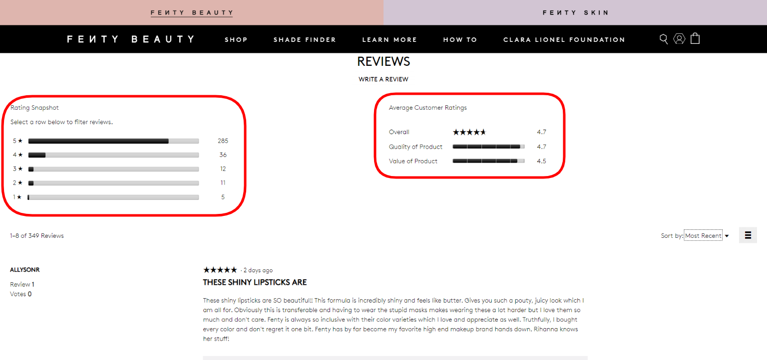
3. Numerous Customer Reviews – Fenty Beauty
Basically, if you want to turn more casual visitors into regular customers, you must have loads of social proof on your website. And the most successful online stores like Amazon, iHerb, or H&M provide the opportunity to rate products and give feedback.
On the screen below, you can see how huge and conclusive such a block looks like on the Fenty Beauty website. It begins with the average rating of a particular item that helps to instantly estimate people’s impressions. Then you can dive deeper into details.
Screenshot taken on the official Fenty Beauty website
As it’s shown on the screen below, the page has a nice photo gallery, an “Add to Wish List” button, a sufficient product description, user-generated content, and some little hints.

Screenshot taken on the official Fenty Beauty website
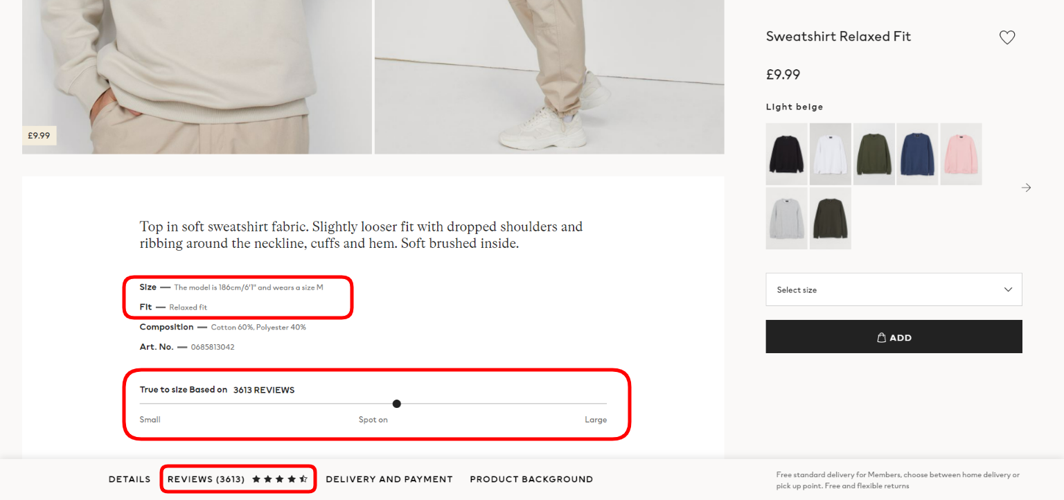
4. Wholesome Prompts – H&M
These elements are a huge aid for users who objectively can’t try on items online. If you want a better conversion rate on your online store, add a couple of useful hints as H&M did.
Have a look at the screenshot below. What we see almost instantly is the note regarding sizing. The model’s height and the size of this sweatshirt on him help to understand which size would be perfect for a customer. Furthermore, the “True to size” bar showcases whether the item turned out a bit smaller or bigger for other buyers. The page would be even greater if it included care info and a size chart.
Screenshot taken on the official H&M website
Certainly, H&M’s product page has many more important blocks such as reviews, the “Style With” section, and a social media widget that we’ll observe next.
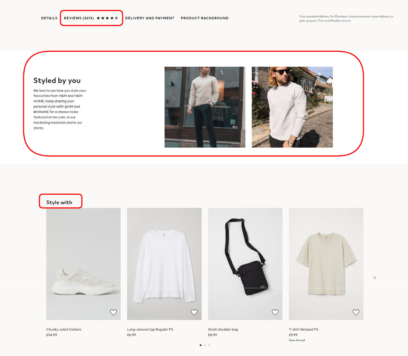
Screenshot taken on the official H&M website
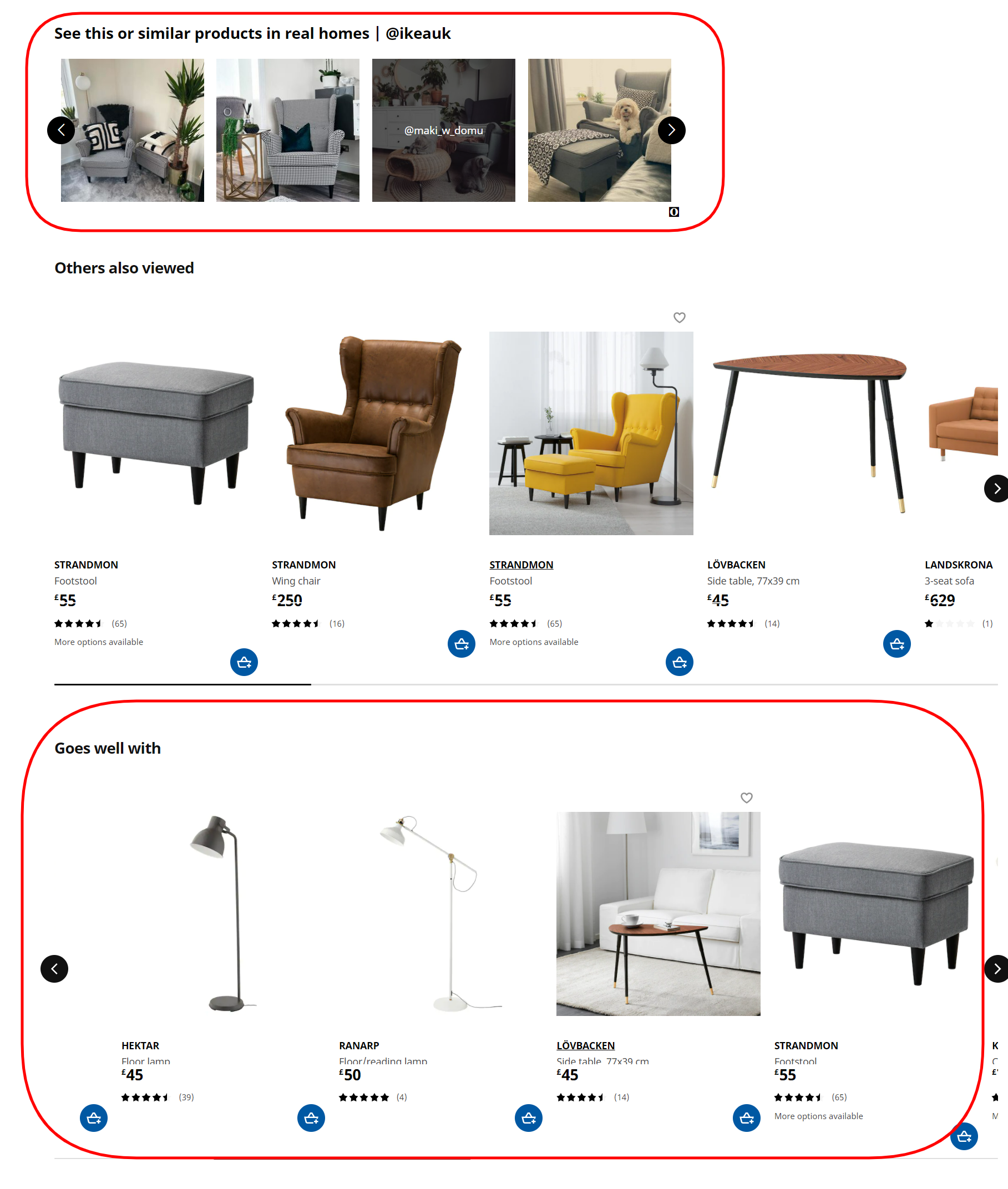
5. User-Generated Content – Ikea
The strength of such content is its demonstration of products in real life without tempting marketing praises and retouching. Take a quick peek at the screenshot below to see how intelligently Ikea uses customer content on its product pages.
These photos look so cozy that a prospect begins to desire the same effect in their own interior. When you click on the photo, you see all links to the items featured there and can check out the account of the client who made the shot.
Ikea’s product pages contain other attractive elements, including the section “Goes Well With” which offers other furnishings that perfectly fit the style of the main product on the page. Let’s dig deeper into this subject.
Screenshot taken on the official Ikea website
6. Smart Product Recommendations – Farfetch
Leverage such blocks as they help to substantially increase chances of up-selling and cross-selling. Farfetch is a brilliant example here, browse the screenshots below.
Firstly, it has a “Complete the look” option. Right on the product page, you can purchase the whole outfit that a model is wearing. Secondly, the online shop offers not random but very specific items similar to what a prospect has sought on the website so far. For instance, you are interested in buying a jacket and have looked through a dozen of them. The algorithm understands your aim and taste; therefore, it offers a personalized selection of similar jackets that you haven’t seen yet.
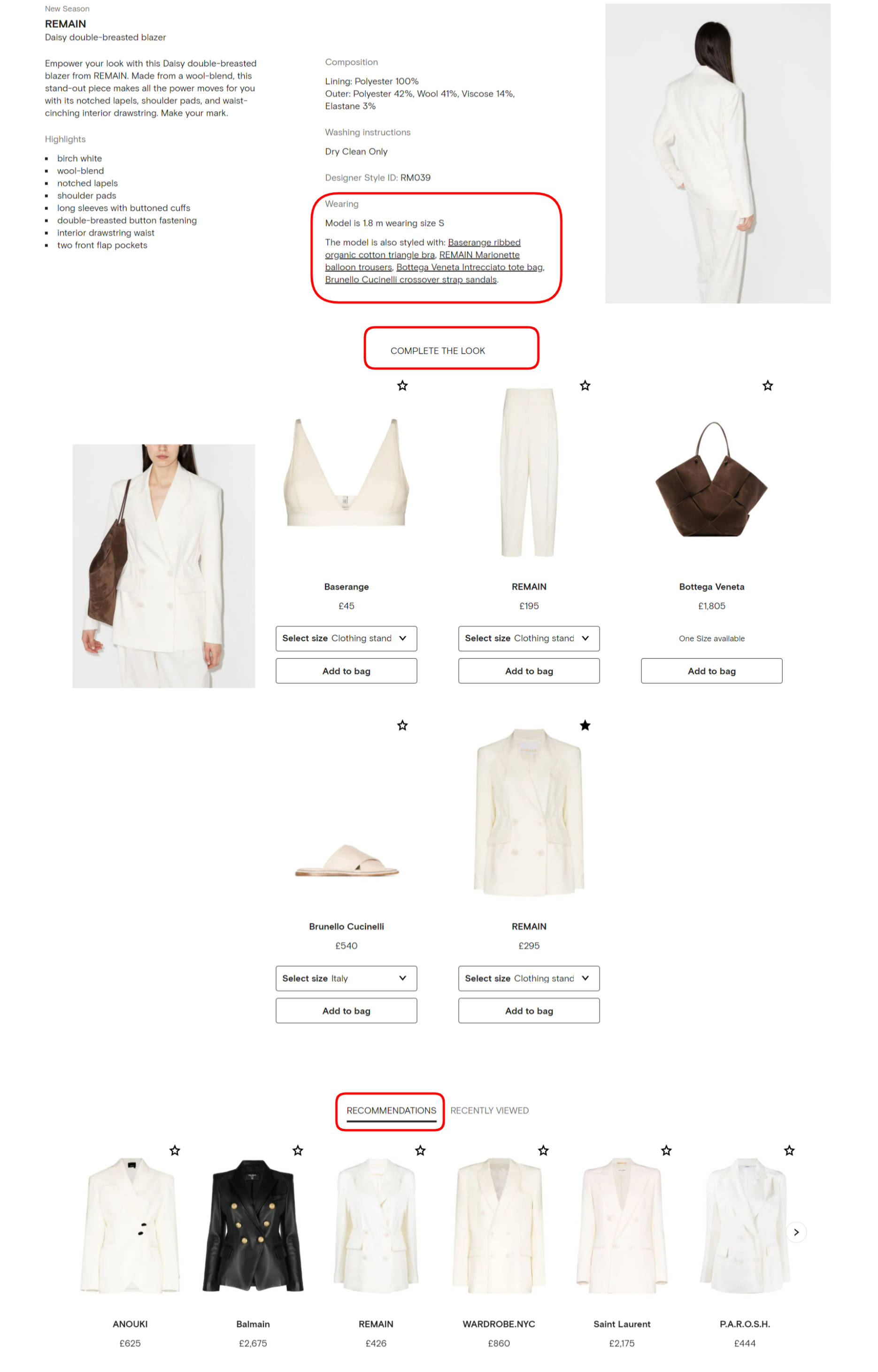
Screenshot taken on the official Farfetch website
Some brands go even further in personalization. Let’s discuss product constructors!
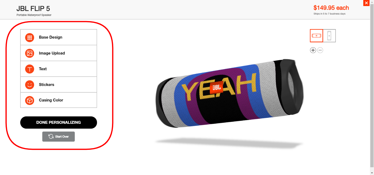
7. Product Customizer – JBL
A product builder is a wonderful tool that has the potential to engage more people and satisfy the most demanding of them. This is an opportunity to create your own style of garments, shoes, accessories, and even cars.
Let’s have a look at how JBL encourages leads to design unique speakers and headphones. We can see the “Design Your Own” button on the product page. It’s worth noting that the possibilities are wider than we would expect. A user can choose varied solid colors, patterns, prints, and even their own pics or photos for the base. Further, they can add text and stickers. Finally, the bespoke item is ready for order.
Screenshot taken on the official JBL website
Besides this, JBL’s product pages are equipped with numerous customer reviews, Q&A blocks, and even an AR-based option that allows you to view a speaker in your room.

Screenshot taken on the official JBL website
8. Virtual Try-On – Garnier
Businesses are implementing augmented reality into their product pages quite actively. AR-powered try-on is widely used in apps and on the websites of footwear and cosmetics brands.
For instance, Garnier invites visitors to their website to play around with new hair colors. You can do so either via a live camera or by uploading a photo. It’s an extremely helpful option that gives an idea of whether to try a new color or not. And your hair is safe!
As you can see on the screen below, reviews and a detailed product description are presented on this product page as well.

Screenshot taken on the official Garnier website
9. Little Helpful Options – Bottega Veneta
The penultimate point on our list is dedicated to simple yet useful features such as “Wish List”, “Notify Me”, and “Preorder” buttons. These tools allow potential clients not to lose the liked goods even if they aren’t ready to place an order in case commodities are out of stock.
Have a look at the screen below from the Bottega Veneta online store. The product page also contains information about the approximate date of shipping.
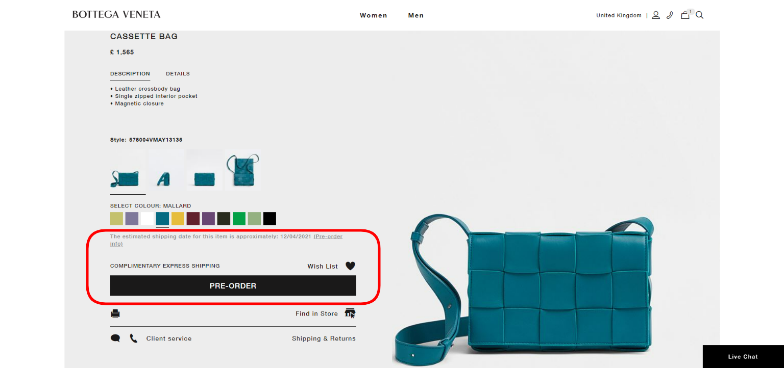
Screenshot taken on the official Bottega Veneta website
10. Efficient Hooks – Missguided
Finally, let’s talk about some attention grabbers that can urge a prospect to make an order right now. Quite often brands mark bestselling items and add different signs of scarcity.
For example, here’s a screenshot from the Missguided online store. Its category and product pages have such marks as “Selling fast” and “Sold N minutes ago”. These hooks underline the popularity of particular items and attract a user’s attention to them. Others add triggering highlights like “Limited edition” or indicate the time frames when the special prices are available.

Screenshot taken on the official Missguided website
To Conclude
Diligently organized product pages make it easier for a lead to fulfill their journey to the bottom of the sales funnel. So, what you need to do first is to overview and ameliorate the performance and UX/UI of your eCommerce site. After that, add at least several of the features listed above to your product pages. Conversions and then revenues will inevitably grow!
About the Author
Kate Parish

Kate Parish, Chief Marketing Officer at Onilab with 8+ years of experience in Digital Marketing and website promotion. Kate always strives to stay in pace with the ever-advancing online world, and the sphere of Magento PWA development. Her expertise includes in-depth knowledge of SEO, branding, PPC, SMM, and the field of online sales in
general.